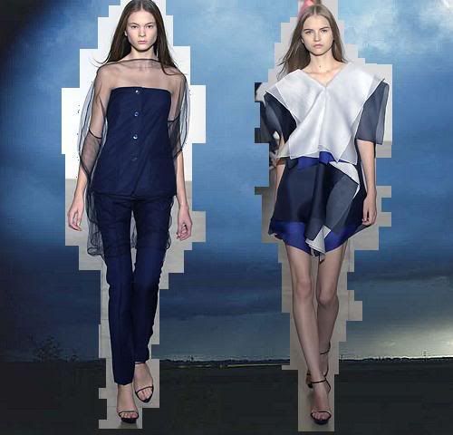
I know it’s a little too early to say but I’m thinking Jil Sander is ranking high up there in the chart of top 10 collections of SS08 for me. Raf Simons is taking the label outside of the boxed-in attitude and there’s a definite intent to expand the Sander clientale as well as trying to keep them happy. The sillhouettes are still sharp with the ultra short boleros and skinny skinny trousers but there’s an overall softening up of the ‘strict and restrained’ qualities that Jil Sander is known for.
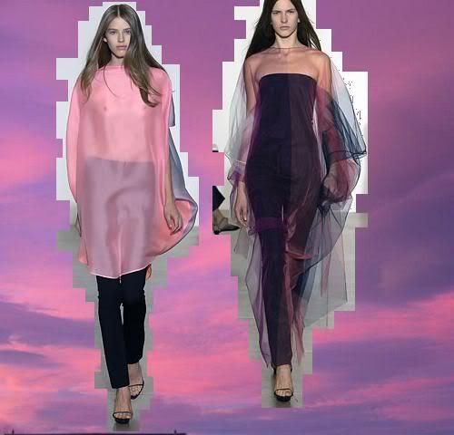
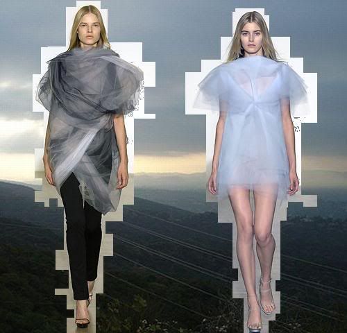
Who knew all that chiffon and sheerness could look that sleek as opposed to ‘pretty’ and ‘goddess-like’? Stiff voiles, organzas and sheer chiffon are all materials that I’m looking at with a twinkle in the eye for the new season. I guess the sheer A-line skirt at Miu Miu AW07-8 started that curiosity within me. The contrast between heavily opaque and delicately sheer is balanced skillfully by Simons.
I’m also impressed with Raf Simons’ choice of palette. Style.com claims the colours are ‘unlikely to hit the spot at retail’ but in my books, his colours of the sky would be hard to resist in person. The combination of the pastels and vibrant, light and dark all works because he sticks to a few base colours and because he has paired sherbet orange with pale blue, I’m re-assessing the former colour even though I never would have considered it before. In short though, who wouldn’t want to be wearing a bit of sky?


I love connecting fashion and shoes and accessories to nature. You’ll find far braver color combinations in your garden, the forest or the sky than we people tend to think of.
It’s easy to be inspired by it and it surprises all the time.
Luv
Poochie
http://www.shoedaydreams.com
shoedaydreams.blogspot.com
far and away my favorite collection. I may or may not have actually exclaimed “thank you!” when I saw the photos yesterday.
I never cease to be amazed by the sky and raf simons..
I would have to agree with you, everything about Raf simons for Jil sander is right. I love all styles, Galliano’s romanticism, Kenzo’s folkiness, Prada’s textural approach, and Chalayan’s quirkiness I can totally identify with. But it is Raf Simons’ collection that I look forward to the most and it is the only one that never ceases to induce a sigh and almost tears. THis is what I call achingly beautiful.
forgive me for sounding soppy……….
LOVED IT.
love it good thanx.
LOVE what you did to the photos. makes them that more original you know?
stop reading my mind! ; )
i love your presentation! it’s great!
love what you did with the runway pics, now i’m really feeling the color palette with references to the sky right behind it!
this is absoulutly one of the best collections so far! i have never really got this excited for a jil sander collection, but i would wear these in a heartbeat to my own style!
Absolutely gorgeous and Simon’s show for JS easily makes it in my top 10. From a buyer’s perspective though, I also feel that many of the styles’ mixed colour palettes are challenging for retail as well as some of the silhouettes for JS customrs who don’t have model sizes.
Chi-Wai
chi-wai.com
Jil Sander’s is one of the few collections shown in Milan I look forward to seeing, but I felt a little let down by this collection. An interesting note though: when I saw it on your page, I suddenly liked it more, then I realized what I actually liked was the way you had the images on display! So props to you for that, Suzie!
lest not forget that Jil Sander herself defied her own ‘strict and restrained’ conventions with her last collection; a showing of relaxed, ethereal creations.
this is scatter-brained, dull and unflattering. for me the washed out colors bring to mind Pepto-Bismal and Tums. The navy i do love but doesn’t tie in at all with the rest of the collection. the two leaner sillhouettes are an exception.
not digging this at all. this collection combines the weakest ideas of Paolo Melim Andersson and Francisco Costa; two other designers who like Raf are visionary designers in their own right but not necessarily pushing what the label is known for.
Great post Susie. Love the concept…
THE LOOK